| Table of Contents |
|---|
Control Area
...
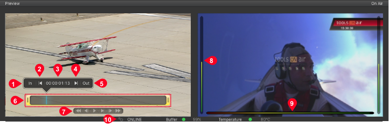
- Set In-Point (Videos only): Defines the in-point of a Video. Scrub the blue CTI and click on In to define a new in-point.
- Go to In-Point (Videos only): Moves the CTI to the defined in-point.
- CTI Position: Shows the timecode of the CTI position.
- Go to Out-Point (Videos only): Moves the CTI to the defined out-point.
- Set Out-Point (Videos only): Defines the out-point of a Video. Scrub the blue CTI and click on Out to define a new out-point.
- Trimmer and CTI (Videos only): The yellow trimmer is a visual representation of the in/out-point. Using the blue CTI you can scrub through the Video, which allows you to get a better overview.
- Control (Realtime Graphics items can also be previewed here. Use the play button to start the preview and to release stop frames. Use the rewind button to jump to the beginning of a realtime Graphic.)
 Rewind
 Play/Pause
 Step One Frame Backwards
 Step One Frame Forwards
 Play Range
 Fast Forward
 - Audio Bars: Audio bars display the Audio level on the left and right side of the On Air View.
- Timecode and Engine Status Overlay: It is possible to show the engine buffer status and the timecode in the On Air View. The Audio bars are always shown.
- Channel and System Status: Shows the status of the Channel, the engine buffer level and the temperature of the CPU running the just:out engine.
Control Area: Timecode Display
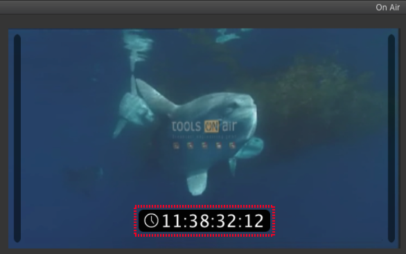
You can choose whether the timecode is integrated into the On Air View or if it is shown as a floating window.
On Air View Timecode
The timecode can be shown in the On Air View. It will not be visible in the final output signal.
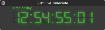
Floating Timecode Window
- To show the timecode in a separate, floating window, unselect the menu item View → Docked Timecode.
- The timecode window can be resized and moved to another screen.
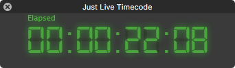
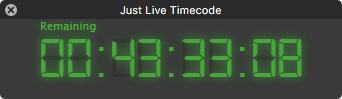
Timecode Modes
Clicking the timecode in the On Air View or the floating window toggles between three modes:
- Mode 1: Time of day.
- Mode 2: Elapsed time of the element playing in the Video 1 track.
- Mode 3: Remaining time of the element playing in the Video 1 track.
Control Area: Channel and System Status
The Channel Status, the Buffer Level and the Temperature allow you to check the status of the Playout engine. The temperature is updated every 30 seconds, so it can take up to 30 seconds before this information is shown for the first time.
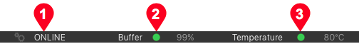
- Green: Good buffer status.
- Yellow If the buffer status is below 50% it must recover to green in time, otherwise the Playout will stagger.
- Red: The engine's buffer is completely empty and the output will drop frames or even stall completely.
- Green: the temperature is fine.
- Yellow: the temperature is slightly too high, the Playout will stagger if the temperature rises even more.
- Red: the temperature reached a critical level and the Playout will drop frames or even stall completely.
| Warning |
|---|
In case the temperature of the machine running the engine is to high, the operating system will reduce the speed of the machine or shut down certain functions completely. Please contact your system administrator in case the temperature indicator reaches the red level during normal usage. |
Timeline
The Timeline shows all elements which are loaded in one of the available layesr of the Channel but also those elements which are already playing out. This includes the element names, the elapsed/remaining time info and the' "Play" button. The visibility of the final output is defined from top to bottom.
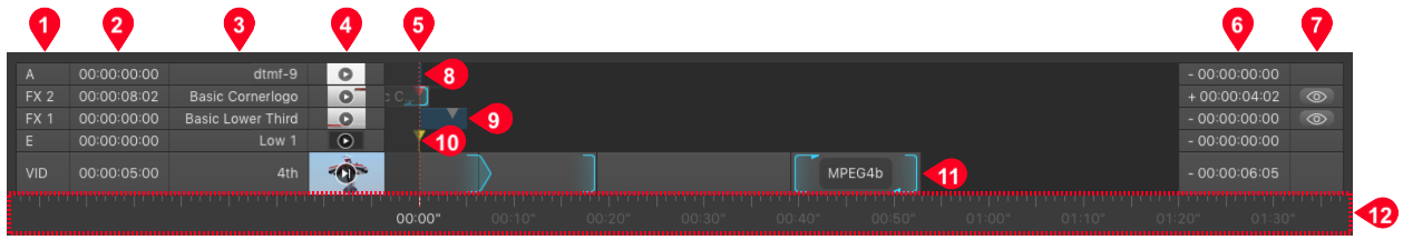
- Layers: Depending on the configuration the Channel you will see Audio, Event, FX- and Video-Layers. The names of the Layers may differ from the ones seen in the figure above, as they have been defined by your system administrator while setting up the Channels in just:connect. It is also possible that your Channel has more or fewer Layers than shown in this figure or that certain Layers do not exist at all.
- Elapsed Timecode: Displays the elapsed time for each actual playing element. If a Layer does not contain any elements the timecode is 00:00:00:00.
- Current Item Name: Displays the name of the current item in the particular Layer.
- Poster Frame: Shows (if available) the poster frame of the current item in the particular Layer.
- Current Time Indicator (CTI): Shows the current Playout position.
- Yellow: The just:out engine is not started.
- Green: The just:out engine is started.
- Red: The just:out engine is started, but there is an FX element waiting at a stop frame.
- Remaining Timecode: Displays the remaining time for each actually playing element.
- Hide/Show Buttons: Toggle the visibility of the currently playing element(s) on the specific FX Layer. The visibility of hidden Layers can be changed in the menu Window → Show Hidden Layers.
- Audio Element: Audio elements are represented by grey bars (or slices, depending on the Timeline scale). Audio items can only be placed on Audio Layers.
- Graphic Element: Graphic elements are represented by grey bars (or slices, depending on the Timeline scale) with a gray triangle in case it has at least one stop frame in it. Only FX Layer compatible files can be placed on a FX Layer.
- Event Element: Event elements are represented by a yellow triangle. Event items can only be placed on Event Layers.
- Video Element: Video elements are represented by grey bars (or slices, depending on the Timeline scale) in the Video Layer. The bright blue part represents a finished action or loop.
- Timeline Scrub & Scale: The scale of the Timeline ruler can be changed by using your mouse wheel while hovering above the Timeline's ruler. The Timeline can either be static or rolling (Window → Static Timeline Ruler). In static mode the Timeline ruler description starts with zero, in rolling mode the description equals the engine time.
Library
The Library shows a filtered view of the repository folders defined in just:connect for the this Channel. Each tab shows only the files which match the type of tab.
- You can navigate the Library like a Finder window (in list view) by using the arrow keys.
- You can preview Videos by pressing the space bar.
- To get information about an item, place the mouse over it and wait for a moment.
- You can hide/show and dock/undock the Library using the corresponding menu options in the View menu.
- In case there are two Videos with the same name in the same folder but with different extensions, setting a new in/out-point and/or poster frame will apply the new settings for both Videos. Move the Videos to different folders to avoid this.
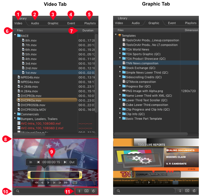
- Video Tab: Lists all Videos from the repository folder(s) defined in just:connect. If a Video does not show up in the list but shows up in the Finder, check if the file ends with one of the supported suffixes: mov, mpg, mpeg, mpegts, avi, mp4, 3gp, m4v, f4v, dv or mxf. Only files with a supported suffix are shown in the Library. Even though just:live displays any avi, .mkv, mp4, mxf and mov file in the Library it is possible that a Video does not play out finally because the correct codec to decode the file is not installed on the system. Contact your system administrator for more information. Videos which do not match the output frame rate are highlighted in red and cannot be selected or added to the rundown. Also you can find the placeholders in the Video tab to switch to the live source, to add a gap to the rundown or to schedule a placeholder item for a Video which is currently not available.
- Audio Tab: Lists all Videos from the repository folder(s) defined in just:connect. MP3, M4A and WAV Audio files are supported at the moment.
- Graphic Tab: Lists all Graphic files from the repository folder(s) defined in just:connect. Only Graphic files with one of the supported suffixes are shown: composition, qtz, js, jscomposition, png or jpg.
- Event Tab: Lists all Router/GPI Events which have been defined by the system administrator before. Such elements can be scheduled at any time by dropping them into the "Event" Layer in the Timeline.
- Playlists Tab: Lists all previously saved Playlists from the repository folder(s). Playlists can be made using just:play but also Final Cut Pro compliant XML files saved in the Playlist folder will show up here for immediate use. Once a Playlist is dropped into the Workbench, all Videos will have the "play next" finished action assigned to them automatically.
- Files: Lists all elements which are available (depending on the selected tab) for Playout on your system.
- Metadata Columns: Depending on the selected tab you will see more or less metadata columns. You can rearrange and change the width of the columns by moving the elements in the header area. Metadata elements which are shown in red do not match the current Playout format and will be changed automatically once added to the rundown. Red colored aspect ratio information means that the aspect ratio does not match, red colored codec information means that the field order does not match. Make sure that at least a little bit of a metadata column is visible in the Library, otherwise the metadata will not be read out resulting in a "red" element which can not be added to the Workbench for Playout.
- Preview Area: Shows a preview of the currently selected element. Use the right mouse button (or ctrl-click) for more file related functions like the ability to reveal the file in the Finder. Press the space bar to open Quick Look for the selected file.
- Video: preview the Video, set the in/out-point, define the poster frame. Audio is played out using the system Audio device
- Audio: Audio files cannot be previewed.
- Graphic: preview a Graphics file. In case it has a stop frame, the stop frame will be handled like On Air.
- Event: when activating the Events tab, the preview button changes its functionality and its icon. Clicking the "+" button allows you to build a new Router control/GPI Event.
- Playlists: Playlists cannot be previewed.
- In/Out-Point and Poster Frame Control: See below.
- Search Field: Allows you to search for files and related metadata in the repositories. Click on the magnifying glass to select the metadata column you want to use for the search.
- Control Buttons:
- Item Sorting Order: Click on this button to change the sorting order (from A...Z or from Z...A) of the selected tab.
- Open/Close Preview: Pressing the preview button shows or hides the preview area.
- Refresh: Click on this button to refresh the content of the Library whenever an element is "red" (no metadata available) or not shown at all. This is especially useful in case your disk storage does not support file system Events and therefore the content is not updated automatically.
...
- When dragging a Video from the Library into the Workbench, the "active play" area marked in QuickTime Player is used to automatically set the Video's in- and out-point.
- Defining a new in/out-point and/or poster frame will write this information to the metadata XML sidecar file which has the same name as the Video file. The sidecar files are stored in the same repository as the respective Video files.
...
- Set In-Point (Videos only): Defines the in-point of a Video. Scrub the blue CTI and click on In to define a new in-point.
- Go to In-Point (Videos only): Moves the CTI to the in-point.
- CTI Position: Shows the timecode of the CTI position.
- Go to Out-Point (Videos only): Moves the CTI to the out-point.
- Set Out-Point (Videos only): Defines the out-point of a Video. Scrub the blue CTI and click on Out to define a new out-point.
- Trimmer and CTI (Videos only): The yellow trimmer is a visual representation of the in/out-point. Using the blue CTI you can scrub through the Video, which allows you to get a better overview.
- Control (Realtime Graphics items can also be previewed here. Use the play button to start the preview and to release stop frames. Use the rewind button to jump to the beginning of a realtime Graphic.) Rewind Play/Pause Step One Frame Backwards Step One Frame Forwards Play Range Fast Forward
- Set Poster Frame (Videos only): Defines the poster frame which will be used for this Video.
Workbench
The Workbench is used to organize and view your elements which are ready for being aired. just:live provides two views to do this. The following chapters explain their functions and usage.
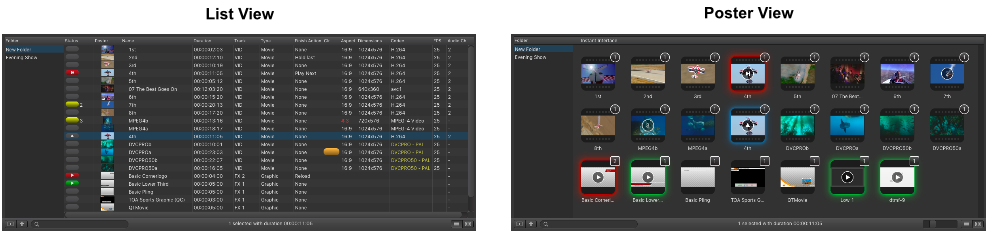
Workbench: List View
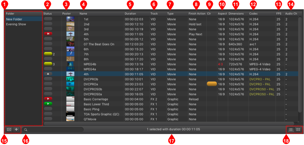
- Folder List: You can create folders to organize files. Click the "+" button in the lower left to add a folder. Press the backspace key to remove the selected folder.
- Status Column: Displays the status of items (see next chapter).
- Poster Column: Poster frames of items. Poster frames are generated automatically but can be changed in the Library before an item is added to the rundown. Once it is part of the rundown, the poster frame can not be changed anymore for this particular item.
- Name Column: Shows the names of Playlists and items.
- Duration Column: Durations of elements.
- Track: Displays the track on which the element will be played out.
- Type: Displays the type of an element.
- Finish Action: Displays the finish action of an element.
- Color Column: An item may have a color defined by selecting it in the Inspector. The color for each item is also shown in a column in the Workbench (if this column is enabled). When dragging and dropping items from the Library, the Finder color (if defined) will automatically be set for the item and shown in the Workbench.
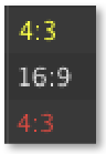
- Aspect Column: This column shows the original aspect ratio of the Video with a color code:
- Yellow: Aspect ratio has been corrected to match the engine's aspect ratio.
- White: The aspect ratio of the Video and the engine is the same.
- Red: Aspect ratio has been changed and does not match the engine's aspect ratio anymore.
- Dimensions Column: Shows the pixel size of the element (how it will be shown on screen).
- Codec Column: Here you can see the codec of the Video with a color code which indicates the selected field order.
- White: Field order matches your engine's field order.
- Yellow: Field order has been changed automatically by just:play to match the engine's field order.
- Red: Field order has been changed manually by the operator but does not match the engine's field order anymore.
- FPS Column: Shows the frames per second of a Video. Only Videos with a frame rate which matches the engine's frame rate can be dropped into the rundown. Videos with another frame rate will be rejected when being dropped into the Workbench.
- Audio Channels: This column shows the number of Audio Channels of a Video.
- Folder Control:
- Folder View Button: Click this button to hide or show the folder list.
- Add Folder: Click this button to add a folder. Use the Inspector to rename folders.
- Search Field: Allows you to search for files in the Workbench.
- Item Count: Shows the number of items selected in the Workbench as well as the total length of the selected elements.
- View Control:
- List View: Activates the List View mode of the Workbench (as seen in the previous figure).
- Poster View: Activates the Poster View mode of the Workbench (as seen in the next chapters).
Workbench: List View States
...

...
Generic Item
...

...
Selected Item
...

...
Scheduled Item
...

...
Loaded Item
...

...
Playing Item
...
Workbench: Poster View
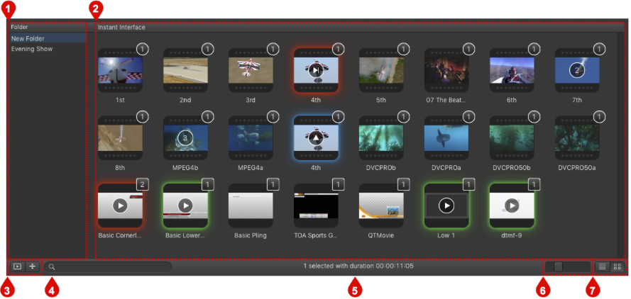
- Folder List: You can create folders to organize files. Click the "+" button in the lower left to add a folder – or press the backspace key to remove a selected folder.
- Instant Interface: Shows the content of the selected folder, where each element is displayed with its poster frame. The different symbols and colors are explained in the next chapter.
- Folder Control:
- Folder List Button: Click this button to hide or show the folder list.
- Add Folder: Click this button to add a folder. Use the Inspector to rename folders.
- Search Field: Allows you to search for files in the Workbench.
- Item Count: Shows the number of items selected in the Workbench as well as the total length of the selected elements.
- Poster Frame Size Slider: This slider adjusts the poster frame size.
- View Control:
- List View: Activates the List View mode of the Workbench.
- Poster View: Activates the Poster View mode of the Workbench.
Workbench: Poster View States
The poster view uses different symbols and colors to display the content of your folders and the states of their containing elements.
...

...
Not Selected
Represents a Video/Graphic which is not selected.
...

...
Selected
Represents a Video/Graphic which is selected. Clicking the arrow inside loads the item onto the target Layer you have defined in the Inspector.
...

...
Not Selected & Ready to Play
Represents a Video/Graphic which is scheduled. This item is not selected and ready to play. Clicking the play button inside airs the item.
...
...
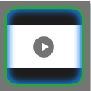
Selected & Ready to Play
Represents a selected Video/Graphic which is scheduled. Clicking the play button inside airs the item.
...

...
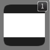
Following Item
Represents an item which is scheduled but currently not on air. Each item of this type has a number inside which indicates the scheduled order.
...

...
Playing
This item is currently on air.
...
...
FX Layer
This additional number in the upper right corner of a Graphics item shows the Layer in which the item will be loaded. This will not be shown if only one FX Layer is activated for this Channel.
...
...
Video Layer
This additional number in the upper right corner of a Video clip shows the Layer in which this item will be loaded. This will not be shown if only one Video Layer is activated for this Channel.
Inspector
The Inspector shows the attributes of a selected item. You can click on the individual fields to edit the attributes. This figure shows different states of the Inspector. Click on the figure to see a larger view.
Using the Inspector
- Enter values directly using the keyboard.
- Use the up/down arrow keys to increase/decrease values.
- Use the left/right arrow keys to switch between values.
- Use the tab key to switch between fields.
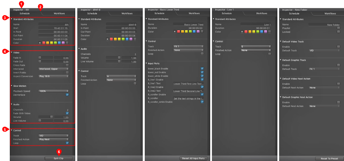
- Name Of The Selected Item: Shows the name of the selected item.
- Schedule/Workflow Tab:
- Schedule: Use this tab to change the attributes of the selected (scheduled) item.
- Workflows: Use this tab to execute on:core based workflows directly here in the user interface. This tab is only available when a Workflow repository has been defined by the administrator.
- Standard Attributes: Shows all the standard attributes depending on the type of the selected element.
- Item Specific Attributes: Shows all the element specific attributes.
- Control Items: Allows to define the track the element will use, the finished action and if the element will be looped or played only once.
- "Fast Access" Button: Changes in context to the selected element.
- Video is selected: Allows you to split the Video.
- Audio/Still Image/Event is selected: No function.
- Graphic is selected: Allows you to reset all input ports (= reset all attributes to their default value).
- Folder is selected: Allows you to reset the Next Actions ports to the value defined in the just:live preferences.
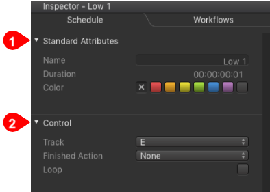
Inspector: Video Specific Attributes
Click on a Video in the Workbench to load it into the preview window and to change its attributes in the Inspector.
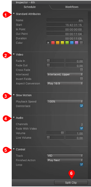
- Standard Attributes
- Name: Name of the Video.
- In/Out Point: Sets the in/out-point of a Video.
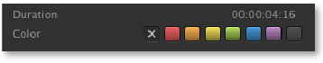
- Duration: Shows the duration of the selected Video depending on the defined in/out-point.
- Color: An element may have a color defined by selecting it in the Inspector. The color of each element is also shown in a column in the Workbench (if this column is enabled). When dragging and dropping elements from the Library, the Finder color (if defined) will automatically be set for the element and shown in the Workbench.
- Video
- Fade In/Out: Videos can fade-in/out up to 10 seconds from and to black.
- Cross Fade: Instead of fading from/to black it is possible to fade from/to the passed-through live signal. Please contact your system administrator if you are unsure wether your Channel has been configured using this method.
- Invert Fields: Inverts fields. This can also be changed during Playout of the selected Video and will be executed immediately.
- Aspect Conversion: Defines how to handle the aspect ratio of the selected Video. Your system administrator should have already predefined a setting in the just:out preferences. Several options are available depending on the direction of the conversion. For a visual description please refer to the chapter Aspect Ratio Control. It is possible to change the aspect ratio while a Video is on air.
- Slow Motion
- Playback Speed: Allows you to set the playback speed of a Video clip (25%, 33%, 50%, 66%, 75% and 100%).
- Deinterlace: Deselect the this option in case you are using another playback speed than 100% and the Video has fields and not frames.
- Audio
- Fade With Video: When enabled the Audio will automatically fade with the Video's fade-in/out settings.
- Volume: Allows you to adjust the volume of a Video with a value between 0 (muted) and 1 (full volume). The volume can be changed while a Video is on air and the change will be taken over immediately once the mouse button has been released.
- Live Volume: This is the volume of the live input. By default the the Live Volume is set to 0 (muted).
- Control
- Track: just:live reflects the activated Layer count for the active Channel, so there can be multiple Layers available for Playout. If you have more than one Video or FX Layer, you can load an element to the Layer of your choice. Select the element, then set the target Layer you want to use in the Inspector.
- Finished Action: Using this function it is possible to define which action is executed once the end of the selected Video is reached.
- Loop: Activate this checkbox to play the selected Video in a loop.
- "Fast Access" Button: Splits the Video clip.
Inspector: Audio Specific Attributes
Click on an Audio file in the Workbench to change its attributes in the Inspector.
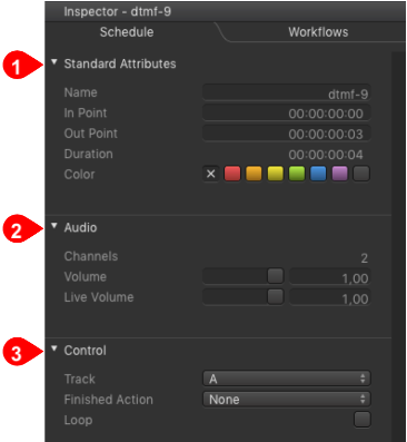
- Standard Attributes
- Name: Name of the selected item.
- In/Out Point: Sets the in/out-point of the item.
- Duration: Shows the duration of the selected item depending on the defined in/out-point.
- Color: An element may have a color defined by selecting it in the Inspector. The color of each element is also shown in a column in the Workbench (if this column is enabled). When dragging and dropping elements from the Library, the Finder color (if defined) will automatically be set for the element and shown in the Workbench.
- Audio
- Channels: Shows the number of Audio tracks coming with this Audio file.
- Volume: Allows you to adjust the volume of a Audio file with a value between 0 (muted) and 1 (full volume). The volume can be changed while the Audio is on air and the change will be taken over immediately once the mouse button has been released.
- Live Volume: This is the volume of the live input. By default the the Live Volume is set to 0 (muted).
- Control
- Track: just:live reflects the activated Layer count for the active Channel, so there can be multiple Layers available for Playout. If you have more than one Audio Layer, you can load an element to the Layer of your choice. Select the element, then set the target Layer you want to use in the Inspector.
- Finished Action: Using this function it is possible to define which action is executed once the end of the selected Audio file is reached.
- Loop: Activate this checkbox to play the selected Audio file in a loop.
Inspector: Realtime Graphic Specific Attributes
Click on a realtime Graphic file in the Workbench to change its attributes in the Inspector. All published input ports of a realtime Graphics item can be changed while it is on air.
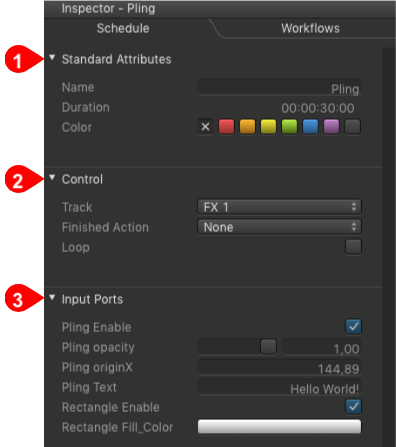
- Standard Attributes
- Name: Name of the selected element.
- Duration: Shows the initial duration of the selected element. In case the GFX element has one or more stopframes, the length can change depending on the length a stop frame will be on hold.
- Color: An element may have a color defined by selecting it in the Inspector. The color of each element is also shown in a column in the Workbench (if this column is enabled). When dragging and dropping elements from the Library, the "Finder" color (if defined) will automatically be set for the element and shown in the Workbench.
- Control
- Track: just:live reflects the activated Layer count for the active Channel, so there can be multiple GFX Layers available for Playout. If you have more than one GFX Layer, you can load an element to the Layer of your choice. Select the element, then set the target Layer you want to use in the Inspector.
- Finished Action: Using this function it is possible to define which action is executed once the end of the selected GFX element is reached. Finished actions which are not available for GFX elements are grayed out.
- Loop: Activate this checkbox to play the selected GFX element in a loop.
- Input Ports
- Slider: A slider can be used to define a value roughly. The exact slider value is displayed in the text box on the right of it. This text box can also be used to modify the slider's value. A slider value has a minimum and maximum value.
- Number Variable: A number value which can be positive or negative.
- Text Field: Text in this field can be changed at any time. It accepts all characters.
- Checkbox: A checkbox is a boolean value (it can be unchecked or checked, "false" or "true"). In this case the checkbox enables or disables a certain element inside of the selected Graphic.
- Color Value: Clicking on the color bar opens a color picker.
- "Fast Access" Button (not visible in the figure): This button allows you to reset all input ports (= reset all attributes to their default value).
Inspector: Event Specific Attributes
An Event has no specific attributes, so only the standard attributes and the control attributes are available. You can execute Router/GPI Events on the Event Layer but also as a start/finished action of a Video. Please see the chapter Start/End Actions (Secondary Events) for further information.
- Standard Attributes
- Name: Name of the selected Router/GPI element.
- Duration: The duration of Router/GPI Events is always one frame.
- Color: An element may have a color defined by selecting it in the Inspector. The color of each element is also shown in a column in the Workbench (if this column is enabled).
- Control
- Track: just:live reflects the activated Layer count for the active Channel. You need at least one Event Layer to be able to execute Router/GPI Events.
- Finished Action: Using this function it is possible to define which action is executed once the end of the selected Router/GPI element has been executed. Finished actions which are not available for Router/GPI elements are grayed out.
- Loop: Activate this checkbox to play the selected Router/GPI element in a loop.
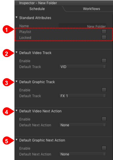
Inspector: Folder Specific Attributes
To define the attributes of a Folder, select the Folder in the Workbench and define the attributes in the Inspector. Doing so, all Videos and all Graphic elements which are dropped into that Folder will get the attributes defined here.
...
- Name: Name of the selected folder.
- Playlist: Activating the "Playlist" option adds a Playlist icon besides the folder name in the Workbench. Clicking once on this icon loads all elements into the Timeline in the order in which they are listed in the Workbench. This feature is very useful if you want to load several elements into the Timeline with a single click. This feature is only available when using the list view in the Workbench.
- Locked: Lock a folder to make sure that no elements within this folder are added/removed or changed.
...
| Child pages (Children Display) |
|---|